
Rename • identity system • digital presence • coordinated brand rollout
Western Resilience Center
Brand Transformation Under Complex Stakeholder Alignment

Background
Western Resilience Center (formerly Yampa Valley Sustainability Council) had spent nearly two years trying to rename and rebrand through multiple agencies, with no real progress. The organization was caught between outdated public perception, a name that no longer fit its mission, and an internal team that wasn’t sure how to move forward.
They came to us looking for strategic clarity and a clear path toward a name, identity, and digital presence that reflected the work they actually do: climate resilience, land and water stewardship, community education, and regional collaboration.

The Challenge
We entered a landscape shaped by:
-
A name that no longer aligned with the organization’s expanded work
-
Public perception rooted in outdated programs
-
A large, highly engaged board with differing opinions
-
Scientific staff unfamiliar with brand and storytelling frameworks
-
Politically sensitive language to navigate
-
Legacy identity elements with emotional significance
-
Two years of stalled progress and strategy fatigue
-
A rebrand tied to a major building opening and public event
This work called for creative leadership grounded in diplomacy, structure, and clear communication.

Our Approach
We began with a two-hour strategy session with the Executive Director, followed by extended conversations with communications staff and key program leads. From there, we built a structured framework to guide decisions, reduce ambiguity, and keep momentum steady.
Our approach emphasized:
-
Clear milestones with explicit decision deadlines
-
Transparent expectations and scope boundaries
-
Science-backed naming criteria
-
Moodboards and tone direction shaped by accessibility and ADA considerations
-
Collaborative alignment instead of open-ended brainstorming
-
Guardrails that lowered the risk of the process unraveling
-
Addendums and updated agreements when the scope shifted
The goal was to give every stakeholder confidence in the path forward.

Naming Strategy & Decision Framework
The renaming process surfaced several competing factors the team had never formally reconciled:
-
Geographic identity vs. broader regional reach
-
Technical accuracy vs. political sensitivity
-
Name length and verbal clarity
-
Spelling, pronunciation, and ease of communication
-
Domain and trademark viability
-
Resonance across multiple audiences
-
Legacy familiarity vs. future growth
We curated two fully developed naming options, each backed by clear rationale, pros and cons, and real-world implications. There was no long list of disconnected ideas, only intentional choices shaped by strategy.
In the end, the board selected a name outside our top recommendations due to internal influence and legacy considerations. We adapted and moved forward collaboratively, making sure the implications were understood and addressed.

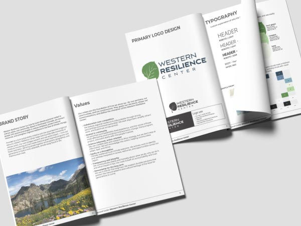
Creative Direction & Visual System
We developed two moodboards based on the staff’s stated preferences and expanded them into:
-
ADA-compliant color palettes
-
A modernized type system
-
Photography and textural direction tied to regional identity
-
Visual elements that connected the legacy brand with its new direction
-
Simplified iconography that works across programs, signage, and digital platforms
-
A clear communication tone that balanced scientific rigor with community accessibility
Throughout the process, we helped scientific staff understand where abstraction was necessary for scalability and where accuracy could remain intact.

Navigating a Nonlinear Path
As the work progressed, a few previously approved decisions shifted, including key elements of the logo after the brand was already live.
Instead of treating these changes as setbacks, we framed them as part of a long-delayed realignment process. We:
-
Reviewed implications with clarity and neutrality
-
Re-established expectations around scope and boundaries
-
Protected the rollout by temporarily locking access to initial assets
-
Rebuilt the identity system in the revised direction
-
Kept communication open and momentum steady, even through the pivots
With a mix of diplomacy and structure, we kept the project moving while reinforcing the integrity of each decision.
The Rollout
The final deliverables included:
-
Complete identity system (logo suite, palette, type, layouts)
-
Brand guidelines
-
Messaging refinement and copy direction
-
Full website design and development
-
Program templates and event materials
-
Social media kit
-
Press and communication assets
-
Signage and print collateral
-
Launch materials tied to the opening of their new building
The rebrand debuted at a major public event with local media and community partners in attendance.

Outcome
-
The Executive Director shared that the strategic brief captured the organization’s direction so clearly that it brought her to tears. She said it was the first time she felt fully understood.
-
Board members expressed strong alignment and enthusiasm for the new name and identity.
-
The community-facing rollout generated positive momentum and engagement.
-
The organization has consistently adopted the new brand across all channels.
-
After two years of false starts, the rebrand finally moved forward with a unified system and a clear strategic foundation.
What We Learned
-
Structure builds trust. Clear expectations and boundaries reduce friction and support better decisions.
-
Diplomacy is strategic. Creative leadership often means navigating tension calmly and keeping teams aligned.
-
Creative direction is more than visuals. It’s the combination of story, systems, clarity, and collaboration that moves an organization forward.