
RENAME • BRAND SYSTEM • TRADEMARK STRATEGY • ON-SITE EXPANSION
RABBIT EARS MOTEL
Modernizing a Landmark Standing Since 1953
Background
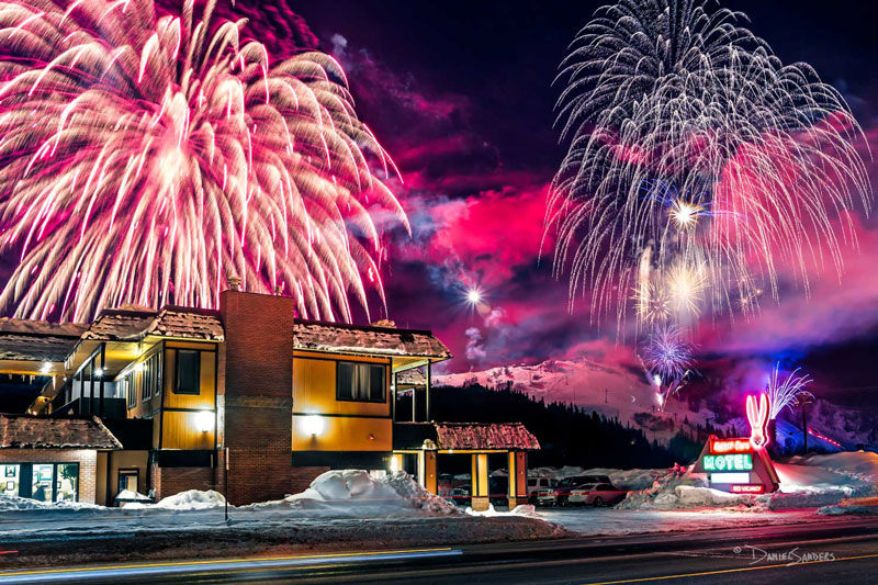
Rabbit Ears Motel has stood in its community since 1953, anchored by a neon sign that's become a landmark of its own. Decades of informal use had left the brand's ownership murky. Graphics had been reproduced, adapted, and passed around without clear rights, and the identity had no clean path to legal protection.
The property needed more than a refresh. It needed a brand that could finally be trademarked, that respected what the sign meant to the community, and that could hold its own against a lodging market increasingly dominated by corporate chains, without losing the independent, family-run character that made it worth saving in the first place.
The Challenge
I stepped into a project shaped by:
-
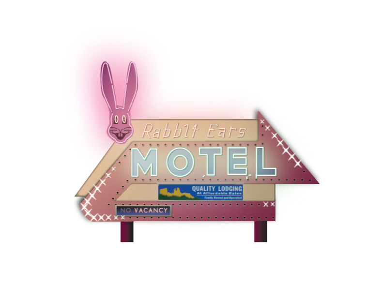
A historic sign that was beloved, but never legally protected as a brand asset
-
Graphic ownership tangled through years of undocumented reuse
-
A property caught between "outdated" and "authentic", modernizing without erasing its history
-
A lodging market increasingly dominated by corporate chains with far bigger budgets

The Approach
I started with a mood board: direction, color, style, before touching a final concept. Once that direction was approved, the strategic questions asked at the start of the project made the path forward clear. The groundwork already pointed to an answer. What remained was executing it.
The sign itself was the design anchor, but a literal, one-to-one reproduction was never the goal. That version had already been done informally, more times than the client could count, and it would have made trademarking harder, not easier. The new mark paid homage to the original while becoming something distinct enough to actually own.
I built in a small amount of room for feedback: a second, friendlier expression already prepared for the rabbit graphic, not because the direction was in question, but because the details were accounted for. When I presented, the client approved on the spot. The only requested change was the one I'd already built.
In those moments I'm a designer, not an artist; artists create for themselves, designers solve problems.
Beyond the Brief
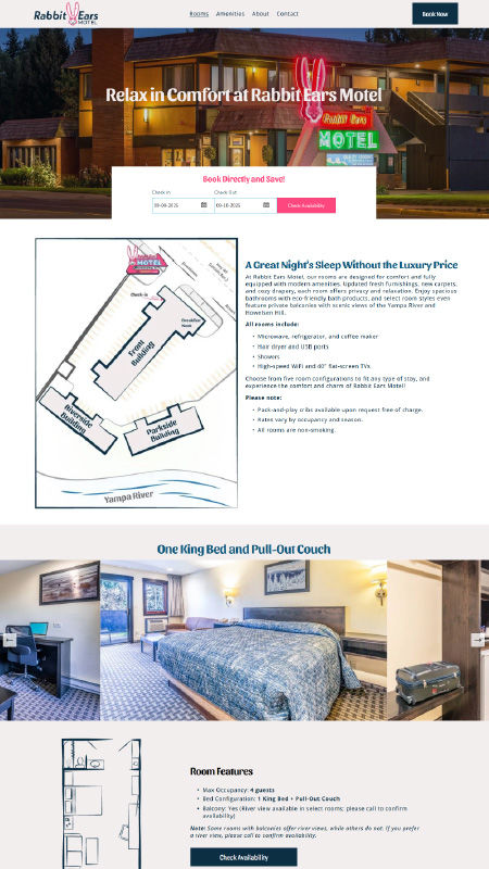
During early strategy conversations, I found a smaller but real problem: guests were consistently confused about room types and layouts, particularly which rooms had river views. While on-site for brand photography, I measured every room myself and produced illustrated floorplans in the new brand system, paired with each room's description and photography, along with a property map in the same visual language.
Nobody asked for this. It gave the property a tool to set expectations before a guest ever booked, cutting down on confused calls and mismatched-expectation complaints after the fact.
Outcome
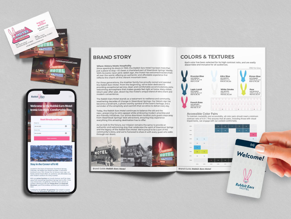
The new brand launched across every guest-facing channel. The owner moved forward with trademarking the design, finally giving the property clear, protected ownership of its own identity. Local news and community response were strong and positive. It's the single biggest brand change in the property's history.