
BRAND EVOLUTION • WEBSITE • CLIENT EXPERIENCE • PHOTOGRAPHY DIRECTION
ENRICH RELATIONSHIP CENTER
Building a Practice Brand That Matched Its Own Expertise
Background
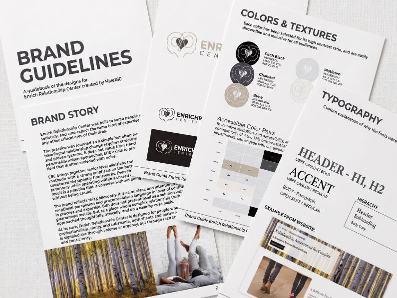
Enrich Relationship Center brought together some of Colorado's most credentialed relationship therapists under one roof, led by a founder whose personal reputation had no trouble attracting high-end clients on its own. But the practice's brand hadn't caught up to what the practice actually was. The website buried what the team treated and who they served, booking was handled differently by nearly every practitioner, and the photography looked like stock imagery from any general therapy office, not a premium practice built on decades of specialized expertise.

The Challenge
I stepped into a project shaped by:
-
A founder whose personal brand had outgrown the practice's collective one
-
Booking handled inconsistently across practitioners, split between phone calls and an underused platform
-
Stock photography that didn't reflect the practice's actual client diversity or let prospective clients see themselves in it
-
A site with buried pages and no clear, fast way to learn what the practice actually treats
Approach
Every practitioner had their own way of taking bookings, some through a booking platform, most by phone. Rebuilding that system properly would have meant guessing at requirements the practice couldn't yet articulate. I chose to remove the inconsistency instead of replacing it: one simple method, consistent across the whole team. That gives the practice a real baseline. In six to twelve months, living with the new brand will show them what they actually need from a booking system, if they decide they need one at all. Right now, they only knew the old one wasn't working. They couldn't say why. It was obvious to me, but knowing what's broken isn't the same as knowing what to build next, and forcing that decision early would have meant guessing on their behalf.
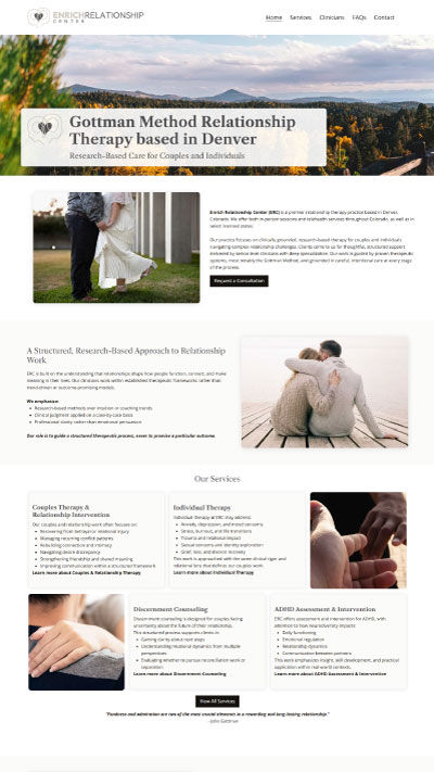
Photography followed a similar principle: solve the stated problem, then go one step further. The practice wanted real diversity represented, ages, relationship types, backgrounds, not a narrow stock-photo default. While building the first homepage concept, I found something further: removing faces from every image entirely. It let a prospective client see themselves in the scenario instead of someone else's face. Presented at the first concept review, it became the visual rule for the entire site, now written into the practice's permanent brand guidelines.
Beyond the Brief
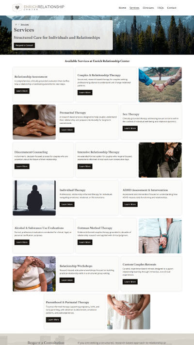
While manually auditing the old site's copy page by page, ahead of writing anything new, I went through it the way an actual visitor would. What I found wasn't a design problem, it was a findability problem: pages buried two and three levels deep, multiple menu paths leading to the same place, blog posts that should have been social content cluttering the structure. Nobody asked me to audit the site's architecture. But a prospective client who can't quickly confirm the practice treats their specific concern doesn't stay to look further. That gap doesn't show up as a complaint. It shows up as someone who simply never inquired.

Outcome
In the months following launch, organic site behavior shifted in a way consistent with the practice's premium positioning goals. With no paid traffic on either side of the comparison, overall sessions decreased, but bounce rate dropped nearly 20%, and contact form submissions increased over 18%. Visitor navigation also became structured and top-down: home, services, clinician profiles, contact, replacing the scattered, blog-driven traffic patterns of the old site with a clear, deliberate path to what the practice actually offers.